
Referencement Romandie.
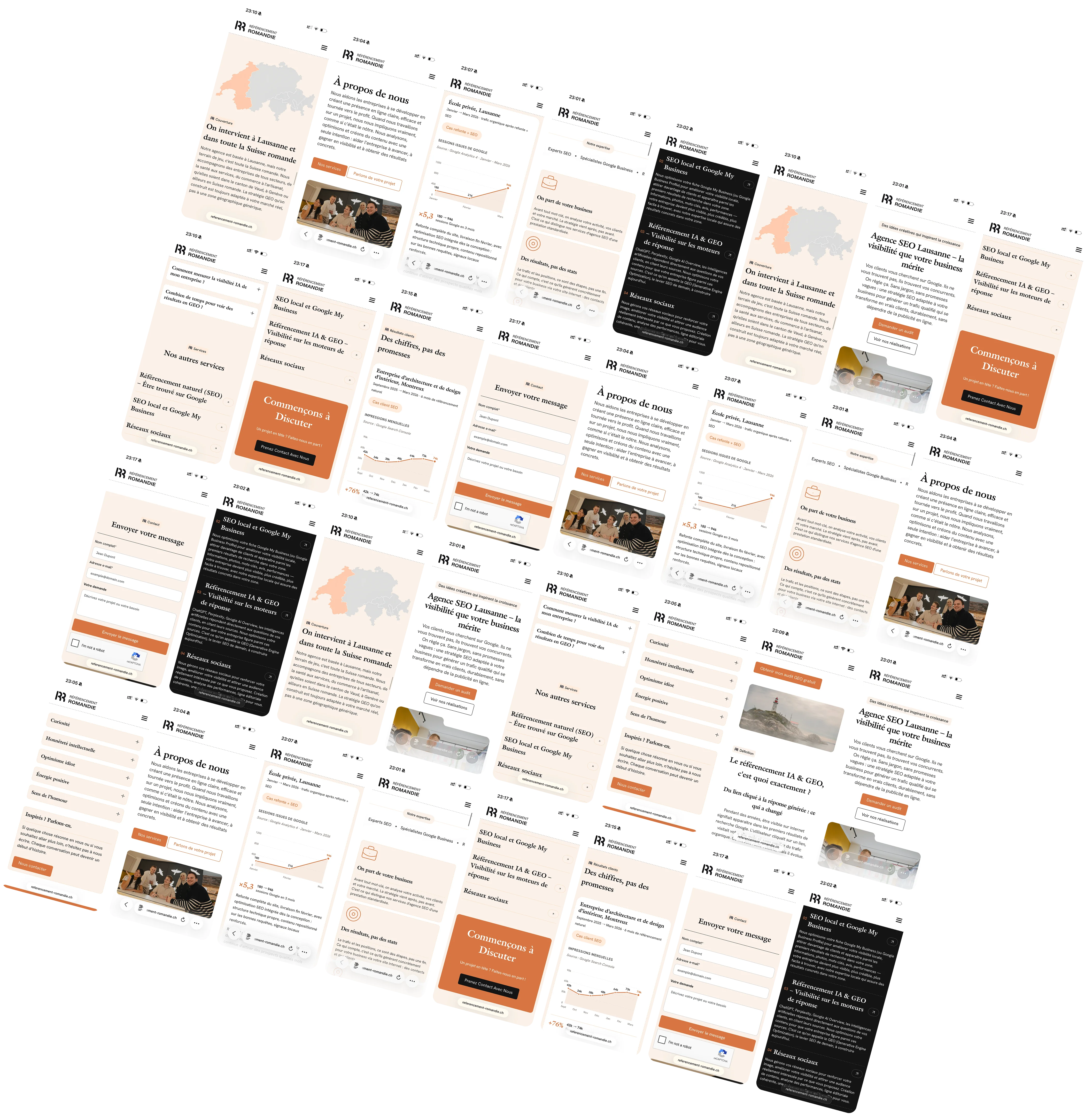
Website redesign for an internet marketing agency (SEO, branding, Google Ads, and web development) in French-speaking Switzerland. The site needed to look sharp, load fast, and practice what the agency preaches: top-tier SEO.

Overview
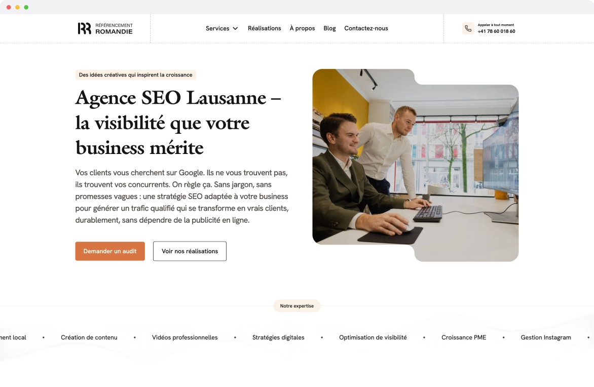
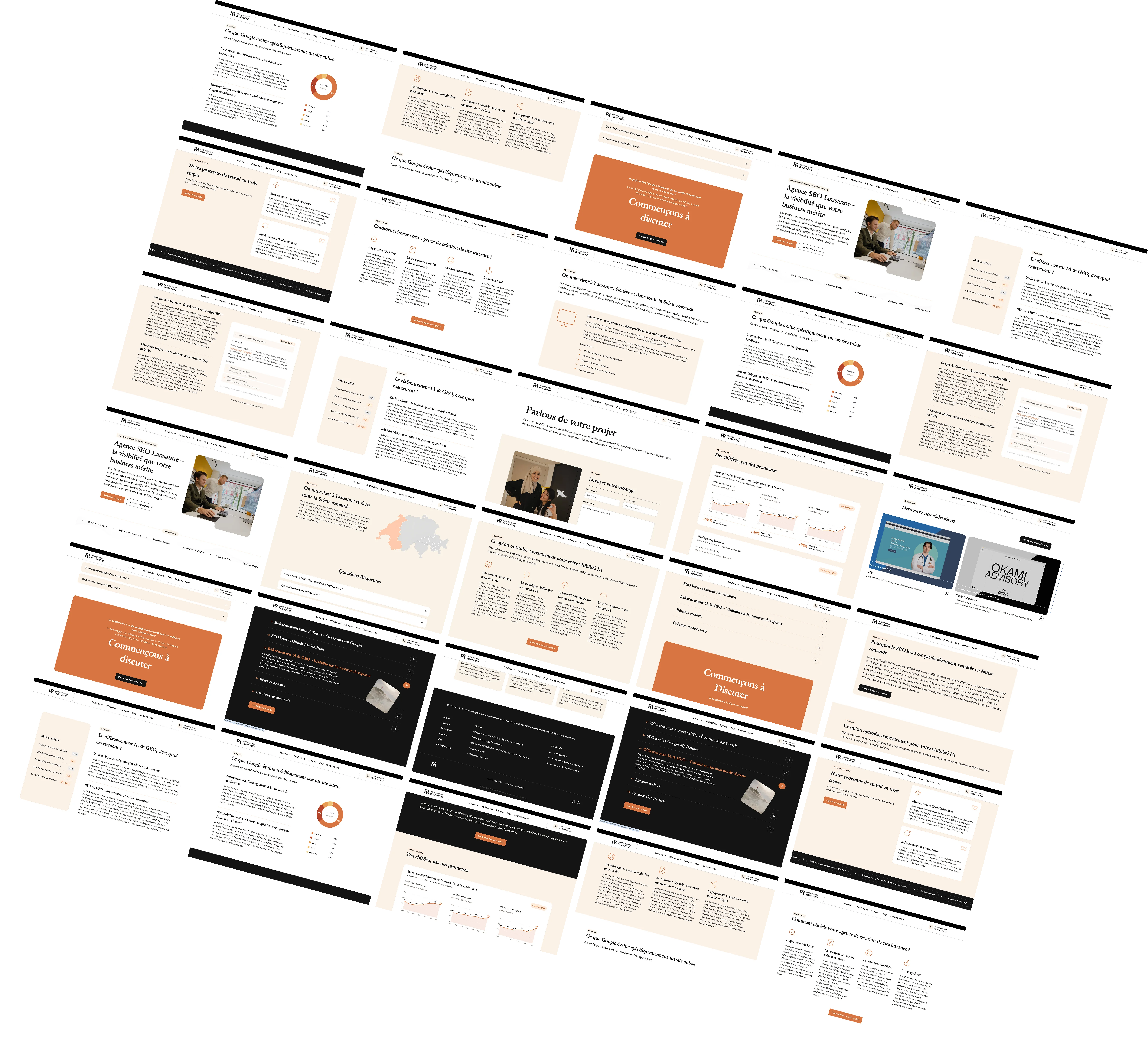
Designed a new website for Referencement Romandie, a marketing agency where I work as a freelance designer on a project basis. They needed a modern redesign and they needed it fast. The visual direction is black and white as the base, with color used only where it matters: on people and their work. This keeps the layout clean and makes the portfolio and team stand out. Since the agency sells SEO services, the site had to be built with SEO best practices from the start, not bolted on after. That meant thinking about heading structure, page speed, image optimization, and content hierarchy from the design phase, not just in development.
Goal & result
Goal
An agency that sells SEO and web design cannot have a mediocre website. The redesign had to prove the agency's expertise the moment someone lands on it. Fast load times, clean structure, strong visual hierarchy, and content organized the way search engines and humans both prefer. The black and white palette was a deliberate choice: it keeps the focus on the work and the people rather than on decorative elements that slow things down.
Result
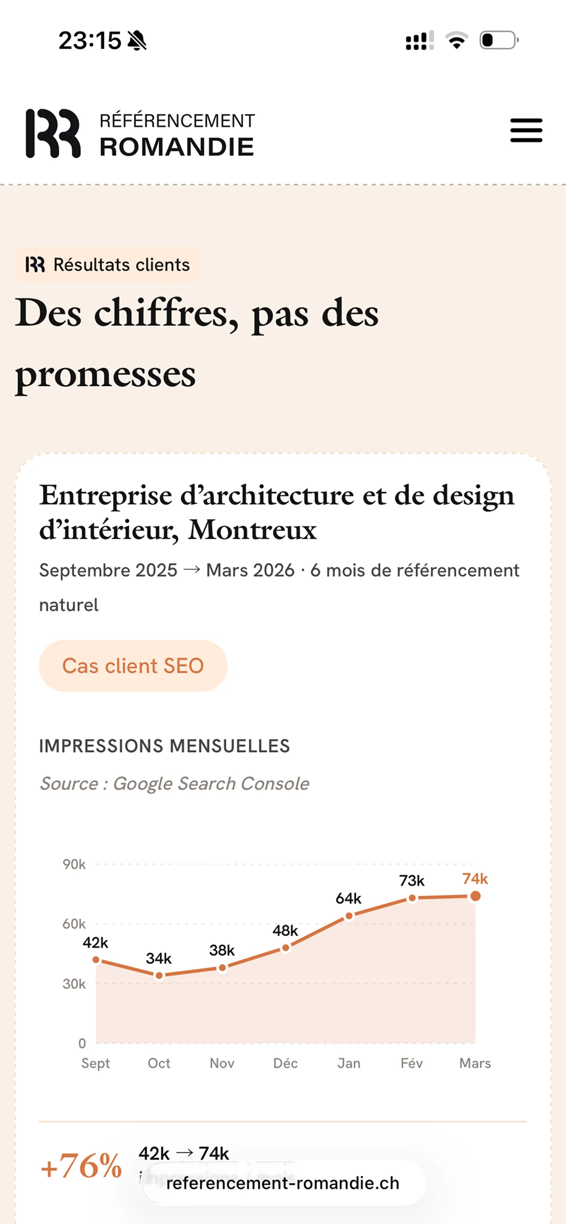
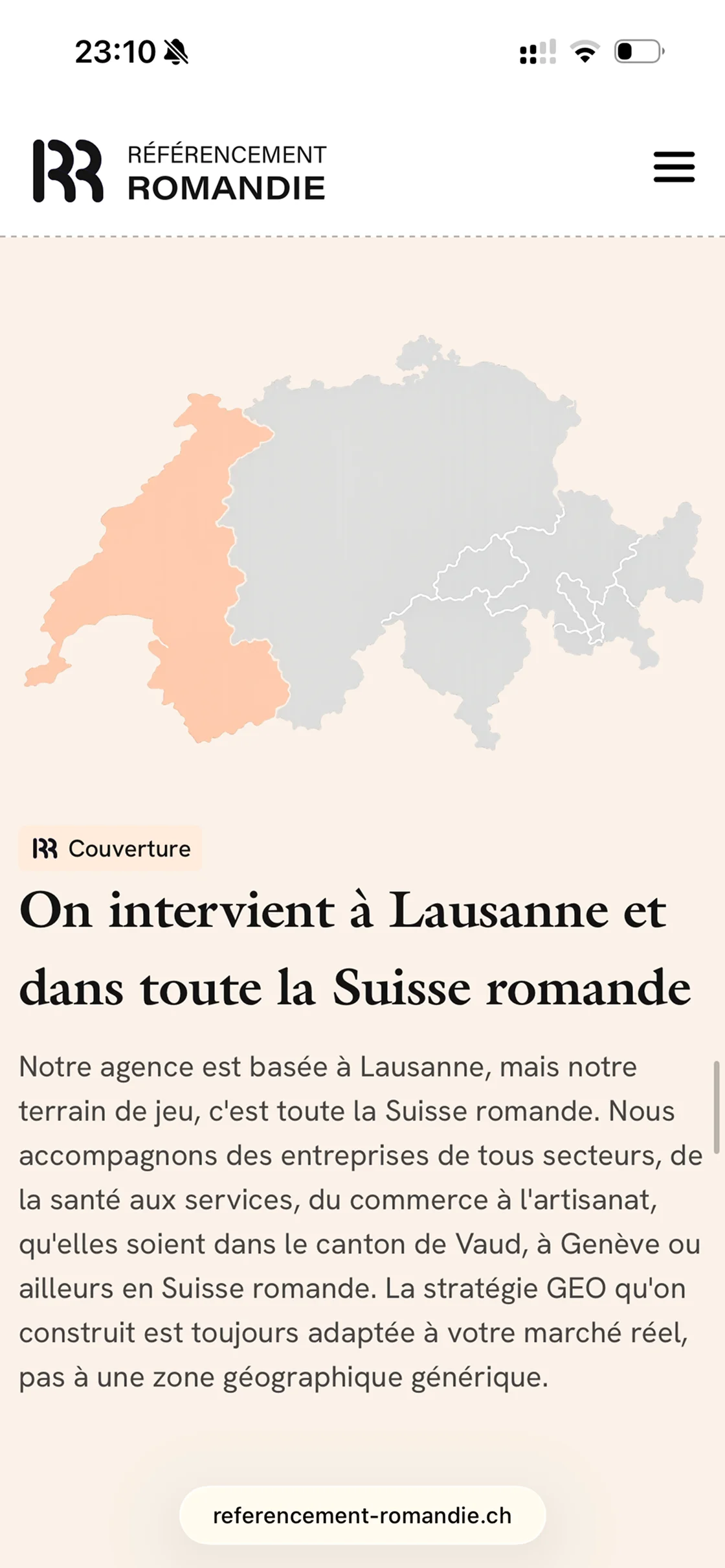
A fast, visually focused site where color only appears on people and portfolio work, making those elements pop against the monochrome layout. The structure is built for SEO from the ground up: logical heading hierarchy, optimized images, fast load times, and content organized so both search engines and visitors find what they need. The agency uses the site as a reference when pitching to new clients.
Closer look
Have a project in mind?
Let's start