
PragmaFer.
Website redesign for a specialist clinic in Lausanne that does iron injections and infusions. The existing site had grown over time and needed a full rethink: clearer structure, updated visuals, and a simpler path for both patients and referring doctors.

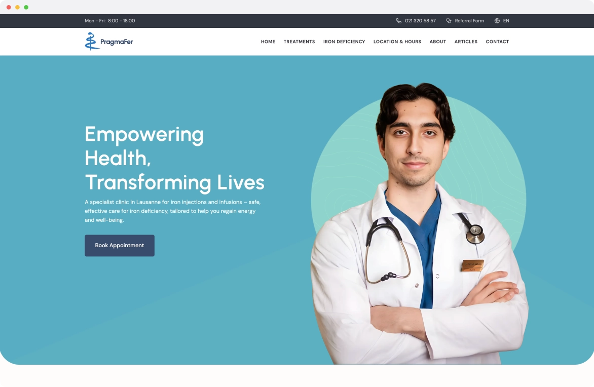
Overview
Redesigned the website for PragmaFer, an iron infusion clinic in Lausanne. The existing site had the same information repeated across multiple pages, a navigation structure that made no sense, and graphics that looked thrown together. The clinic gave me full creative freedom with one instruction: make it good. The hardest part was not the design. It was the cleanup. I had to go through every page, figure out what was actually unique content versus what was duplicated or redundant, then build a new information architecture from scratch. Once the structure was solid, the visual direction came together quickly: a modern medical aesthetic with clear graphics that explain the treatment process without making it feel clinical or intimidating.
Goal & result
Goal
Two audiences visit this site: patients looking for information about iron deficiency treatment, and doctors referring their patients to the clinic. Both need to find what they are looking for fast, and neither should have to read the same paragraph twice on different pages. The old site failed both groups. The redesign had to strip the content down to what matters, organize it so each audience has a clear path, and present the medical information in a way that feels approachable without being dumbed down.
Result
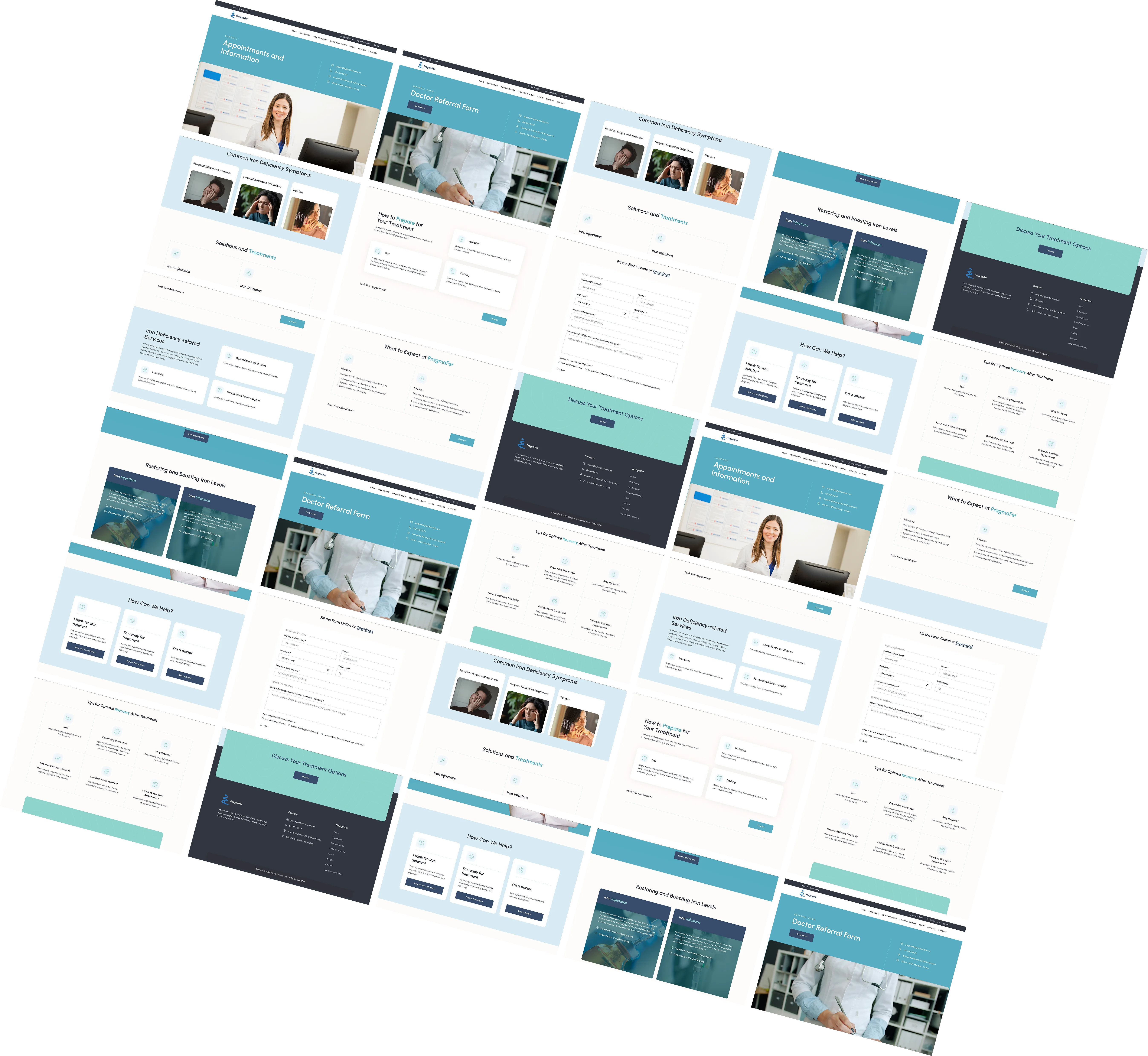
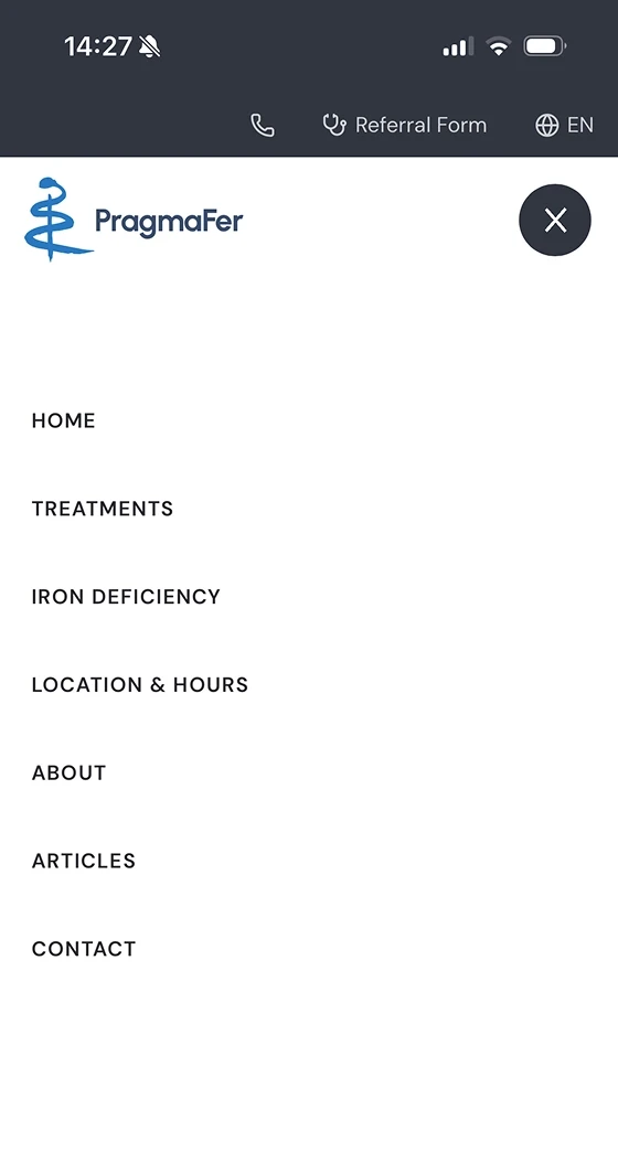
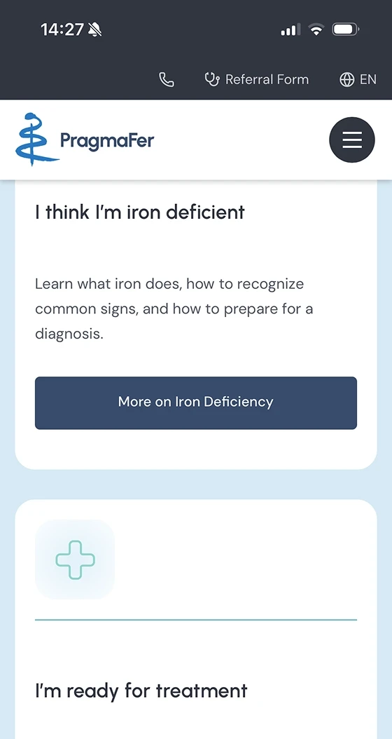
A site rebuilt from the ground up. The page count dropped because duplicated content was merged or removed. Navigation now makes sense: patients and referring doctors each have a clear entry point and path. The treatment process is explained with custom graphics that walk visitors through what to expect, step by step. The overall feel is clean and medical without being cold. The clinic owner trusted my judgment on what to cut and what to keep, which made the project move fast once the information architecture was settled.
Closer look

Have a project in mind?
Let's start