Yieldium.
A Telegram mini app for crypto yield investing. Wallet connections, chain transactions, and gas fees happen behind the scenes. Users just pick a strategy, deposit, and track returns.

Overview
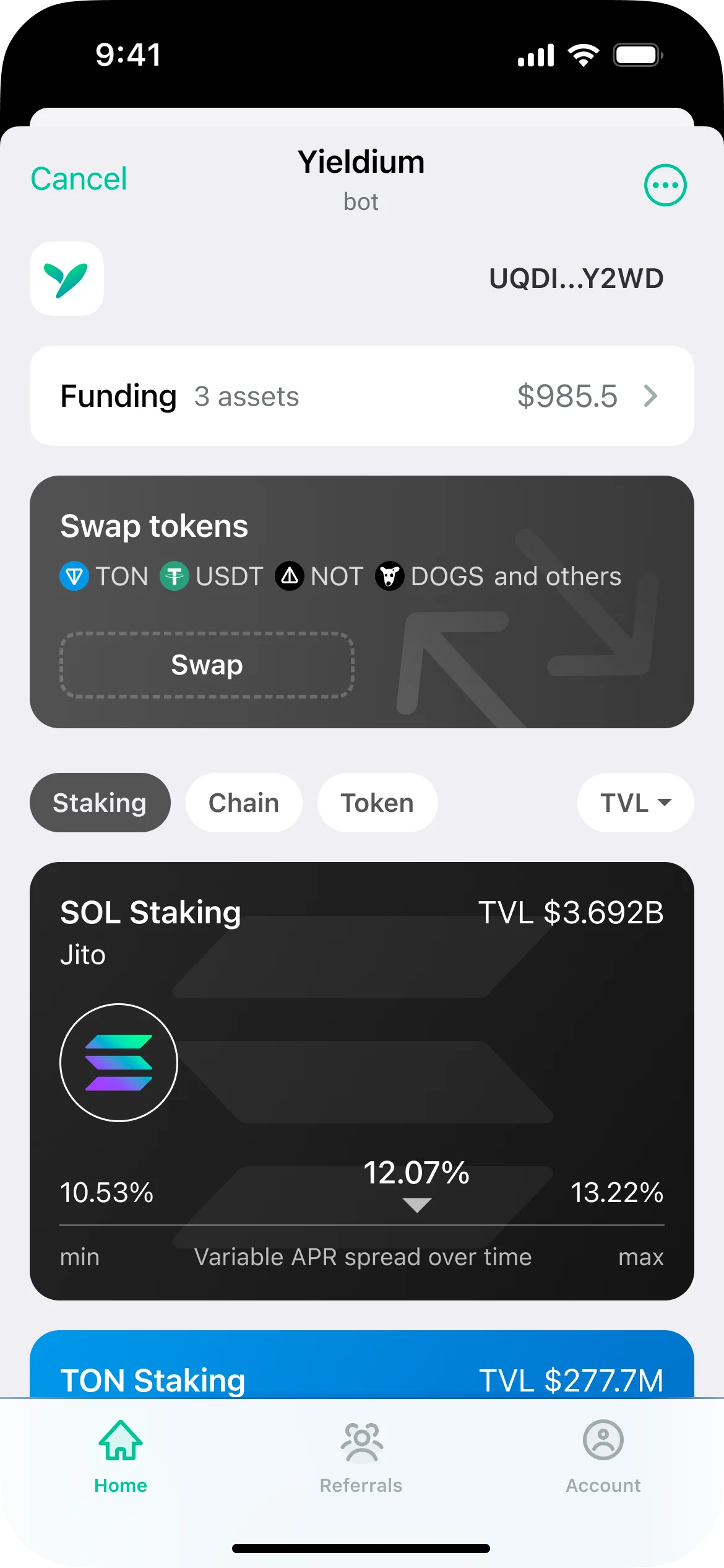
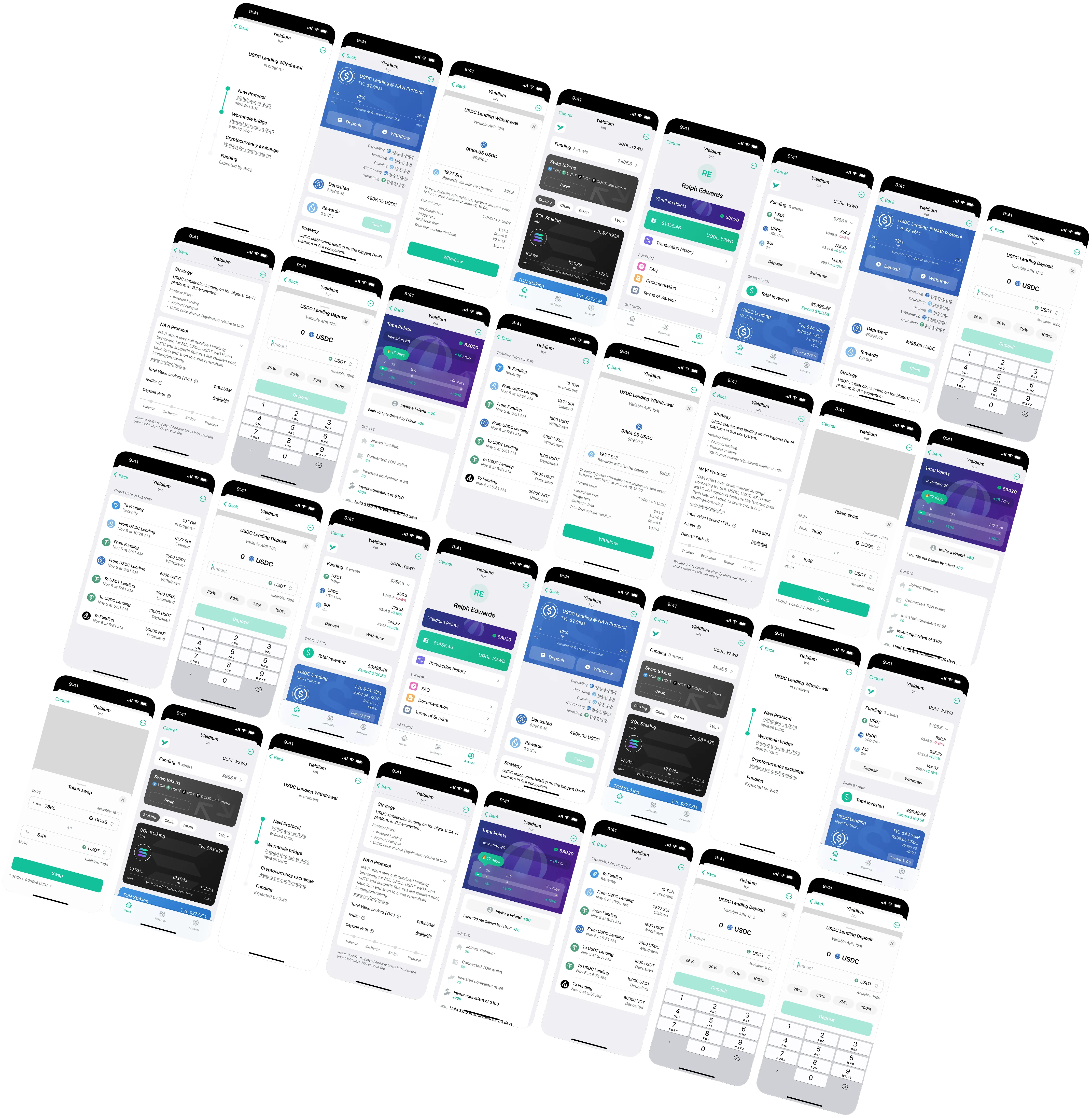
Designed the UX and UI for a DeFi investment product that lives inside Telegram as a mini app. Before I could design anything useful, I had to understand how the transactions actually work: wallet creation, chain routing, gas estimation, deposit confirmation, yield accrual. Most of that is invisible to users, but every step has failure states and edge cases that need a UI response. I built the information architecture, all screens, and the full flow set in Figma, working within Telegram's constraints (limited screen space, no custom navigation, mini app performance limits).
Goal & result
Goal
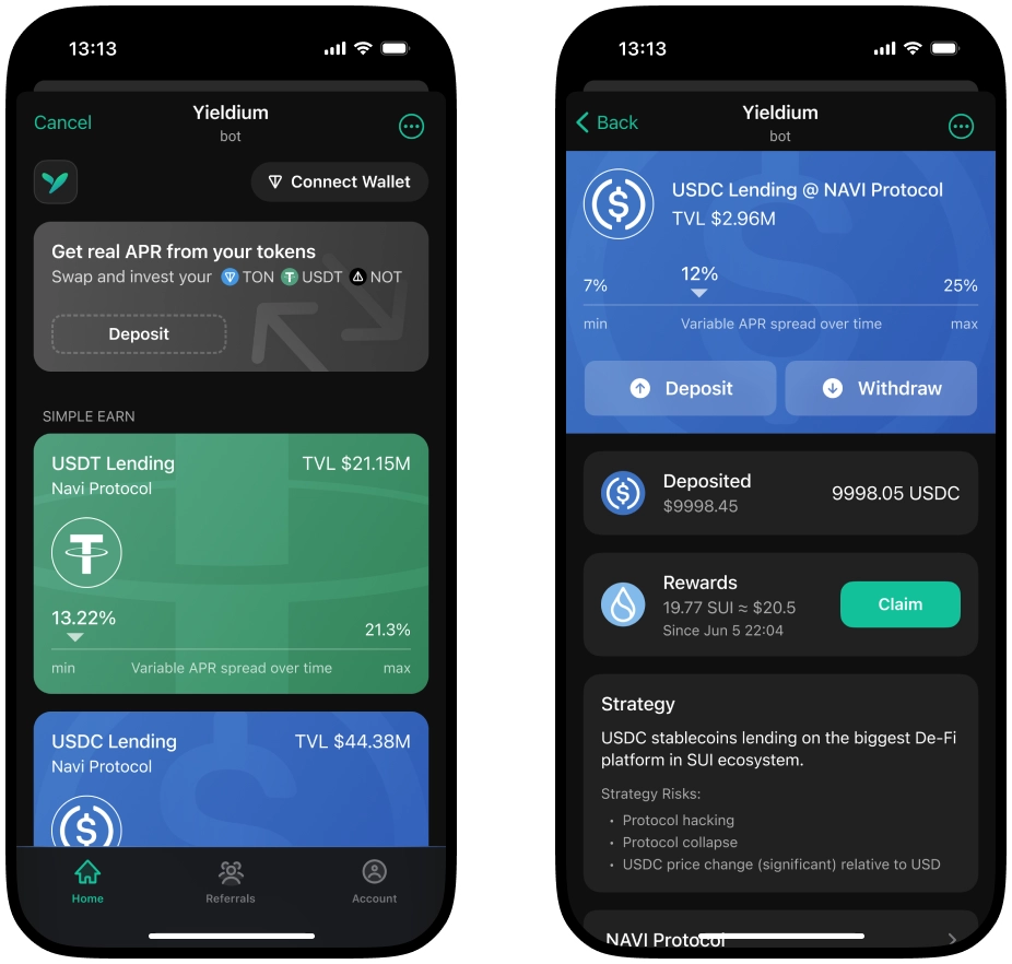
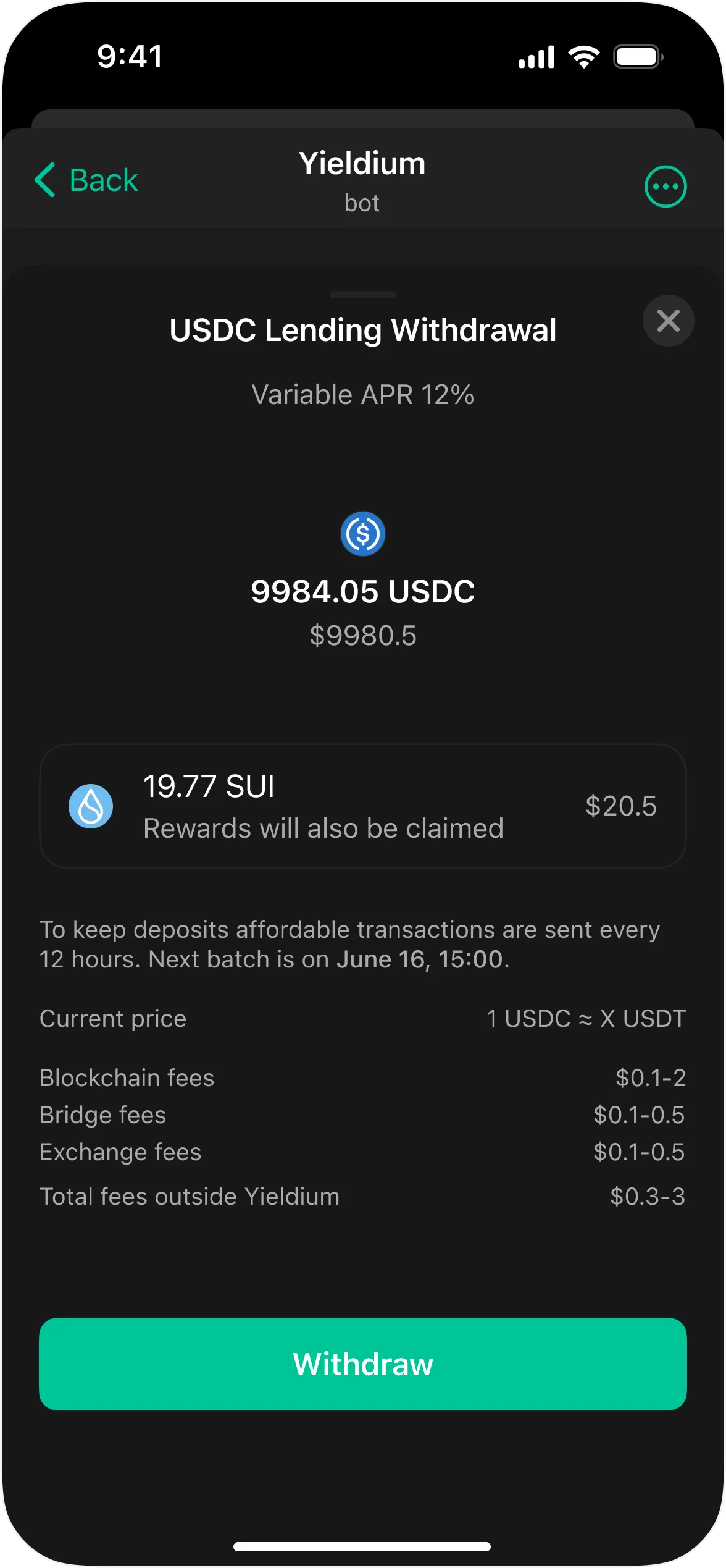
Get users to trust the app enough to put real money in. In DeFi, that trust is hard to earn. If someone does not understand what a screen is telling them, they will close the app. So every piece of information had to justify its presence: yields, risk levels, lock periods, fee breakdowns. And every action that touches their money (depositing, withdrawing, switching strategies) needed a confirmation flow clear enough that they never wonder “what just happened?“
Result
An interface where users browse yield strategies, compare risk and return, deposit funds, and track performance without leaving Telegram. Onboarding takes a few taps. Behind every deposit button there is a confirmation screen that explains, in plain language, what will happen, what the risks are, and how long the funds are locked. Transaction states (pending, confirmed, failed) are tracked visually in real time so no one is left guessing whether their money went through.
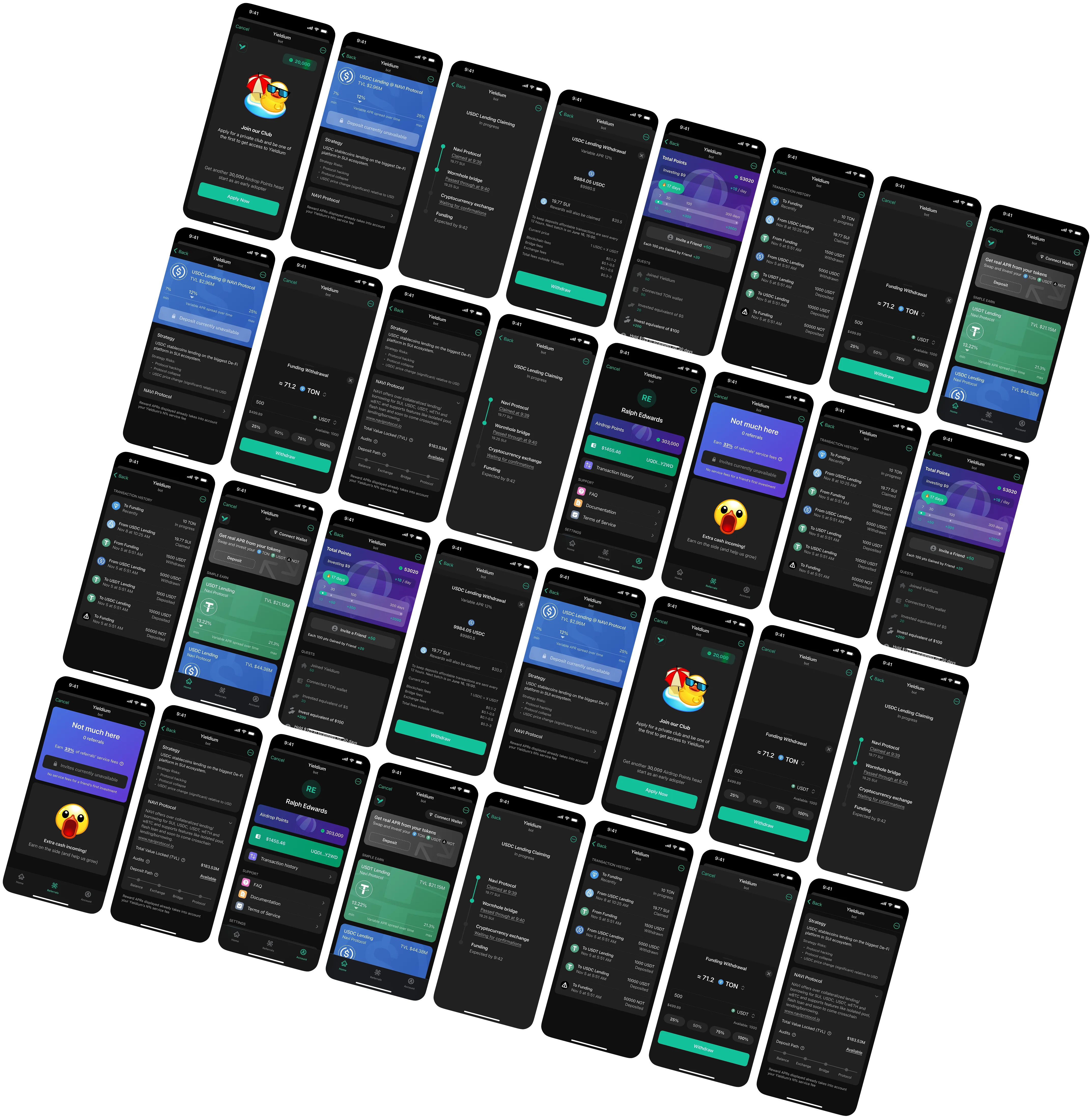
Closer look
Have a project in mind?
Let's start